Lettering is really a kind of freehand drawing for forming the letters of the alphabet and numbers.
Good lettering requires only patience and practice.
Contents
- The Four Types of Lines Used in Basic Lettering
- Single Stroke Gothic Lettering
- Basic Lettering Widths
- Inclined Lettering
- Lettering Practice
- Practicing Strokes
- Right-Handed Lettering Guide
- Left-Handed Lettering Guide
- Making Curved Letters
- Making Numbers
- Letter Spacing
- Word Spacing
- Lettering Tools (and How to Use Them)
- What’s the purpose of guidelines in lettering?
- 7 Basic Lettering Rules for Drafting
- The 4 Guidelines used in Lettering
The Four Types of Lines Used in Basic Lettering
You can learn to letter if you can make these four lines well: vertical, horizontal, slant, and curved.
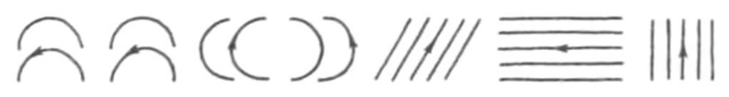
This is because all letters are made up of these four lines in some combination.
For example, an L is made with a single vertical line and a single horizontal line.
The letter U is made with two vertical lines and a short curved line.
Single Stroke Gothic Lettering
The lettering you will learn to do in this article is called Single Stroke Gothic.
That means it is a simple form of letters made with single strokes of the pencil.
Basic Lettering Widths
Look at an alphabet of capital letters.
Notice that all letters are not the same width.
Imagine that a letter is to be made in a little box divided into six spaces wide and six spaces high.
These would be the widths of some letters: C=5 spaces wide; M=6 spaces wide; I: only one space wide.
Look at the width of the other letters.
In beginning drawing, a simpler way is to make all the letters the same width except three.
The J is a little narrower than the others.
the I is just one line wide, and the W is a little wider than most.
That’s easier to remember.
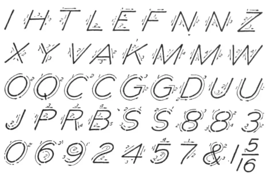
Inclined Lettering
Lettering that is done with all the letters at right angles to the horizontal is called vertical lettering.
Lettering is also done with the letters forming an angle of about 67% degrees to the horizontal.
This is called inclined lettering.
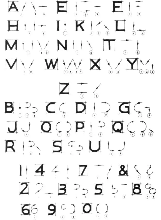
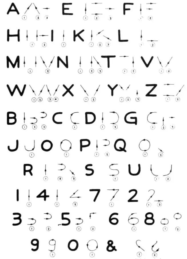
Now let’s look at the alphabet to see how the letters are drawn.
Notice that E, F, H, l, L, and T combine vertical and horizontal lines only.
The A, K, M, N, V, W, X, Y, and Z are made up of vertical, horizontal, and/or inclined lines.
The remaining letters combine all these, plus the curve.
Notice also the arrows and numbers beside each letter.
This suggests a way you can make each stroke to form the letters.
Lettering Practice
Now let’s try to do some lettering.
First, always use guidelines to keep the work straight.
You should use a guideline even when you have a single dimension to put on a drawing so that the numbers look uniform in size.
On most drawings letters are made about 1/8″ to 3/16″ (3mm to 5 mm) high.
The size, of course, varies with the over-all size of the drawing.
It’s easier to form smaller letters than larger ones.
Lay out light, horizontal guidelines on your paper.
These can remain on the drawing.
Now select an H or 2H pencil for lettering.
Be sure it’s sharp.
Sit or stand in a relaxed position.
Hold the pencil lightly but firmly in your hand.
The reason many people never learn to do good lettering is that they tense up too much as they work the lines.
Relax and take it easy.
Rest your elbow on the drawing bench for firm, easy support.
Practicing Strokes
Try some vertical strokes, some horizontal strokes, some slant strokes, and some curved strokes.
Can you make these a uniform length, the lines straight, the curves smooth and always the same angle?
After you have done this exercise for a little while, begin to form the letters.
The A has a horizontal line about one third of the way up.
All the rest of the letters are divided about (but slightly above) center.
The bottom of each letter should be a little larger than the top so it looks stable.
Form all the same shaped letters at one time (all the vertical and horizontal letters) and then go on to try others.
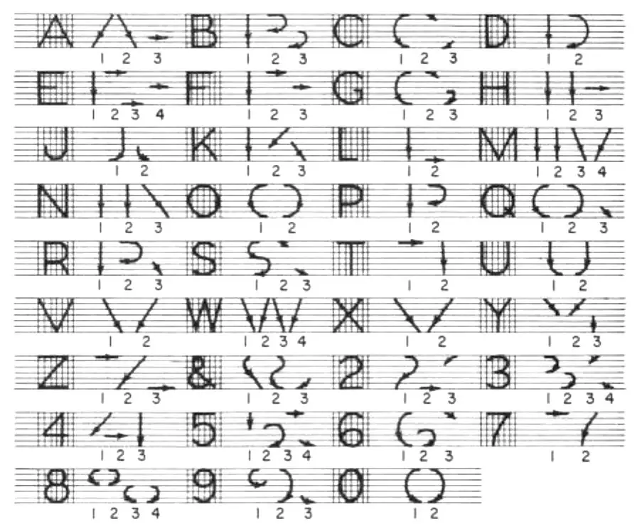
Right-Handed Lettering Guide
The following is a lettering stroke guide for right-handed writers:
Left-Handed Lettering Guide
The following is a lettering stroke guide for left-handed writers:
Making Curved Letters
Many of you will find that your poorest letters are those with curved lines.
These are more difficult to make freehand.
The O is the basic letter in this group.
Make several of them until you get a feel for the circular motion.
Don’t be discouraged with your early lettering, it will not be as even as you‘d like it to be.
lt takes practice.
Making Numbers
After doing capital letters, try numbers.
These are made in the same general way.
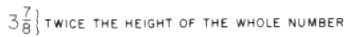
When lettering fractions, make the over-all fraction about two times the height of a whole number.
Letter Spacing
If spaced an equal distance apart, some letters appear farther apart than others.
For example, an I that follows an L would appear much farther away than a D that follows an M.
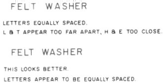
This is because the first two have a lot of white space around them and are open letters, and the other two have little or no space around them and are closed letters.
Therefore, in forming words, place the open letters closer together than the closed letters.
This will make the words appear to be uniformly spaced.
Word Spacing
When lettering a sentence, leave a space between words equal to the width of the average letter.
The space between sentences should equal twice the height of the letters.
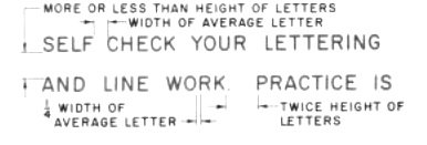
The space between lines of words should be about equal to the height of the letters.
Lettering Tools (and How to Use Them)
Two devices are commonly used for drawing guide lines and section lines.
How to Use a Lettering Guide
A lettering guide is also used for drawing guide lines and section lines.
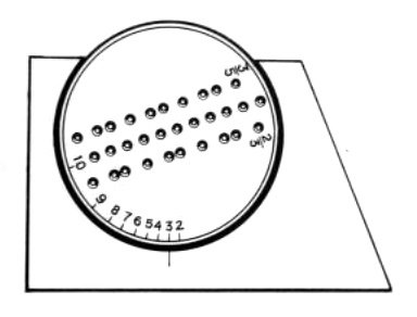
The correct space can be obtained by turning the plastic disc in the frame to the correct number (given in 32nds of an inch).
Here’s a helpful video demonstrating how to use a lettering guide properly.
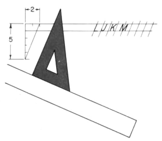
How to Use a Lettering Triangle
One is a lettering triangle with a series of countersunk holes.
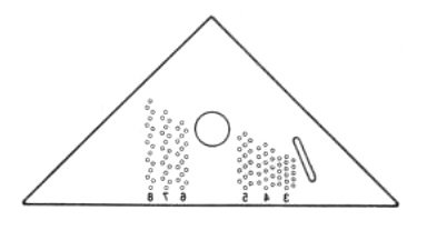
The holes are planned in series for capital and lower-case letters.
For example, to draw 1/8″ guidelines, use the hole marked 4 (the numbers show the spacing in 32nds).
The long slender hole in the triangle edge is used to draw inclined guide lines at an angle of 67 1/2 degrees.
To use the triangle, place it on the upper edge of the T square.
Place the pencil in the hole and then slide the triangle along to form the line.
What’s the purpose of guidelines in lettering?
The purpose of guidelines in lettering is to provide a structure and symmetry to the letter forms, making it easier to create consistent and aesthetically pleasing lettering.
They help to align letters and ensure equal spacing between them, which leads to a more professional and polished look.
Guidelines can also be used to create specific styles of lettering, such as Gothic or Copperplate, by following specific rules for letter construction and spacing.
7 Basic Lettering Rules for Drafting
Here are some basic rules to follow when drafting lettering:
- Alignment: Keep the letters aligned to the baseline and x-height lines to ensure consistency and legibility.
- Spacing: Pay attention to the spacing between letters, making sure they are evenly spaced and not too close together or too far apart.
- Proportion: Ensure that the letters are proportionate to each other in terms of height and width, and that the height and width of each letter is consistent within the word.
- Consistency: Maintain consistency in the style and stroke width of the letters throughout the word or phrase.
- Flow: Create a fluid and smooth flow in the lettering by following the natural movements of the hand and avoiding abrupt changes in direction.
- Readability: Make sure the lettering is legible and easily readable, especially if it will be used for text or signage purposes.
- Experimentation: Don’t be afraid to experiment and try different styles, but always make sure to follow the basic rules of lettering to maintain consistency and legibility.
The 4 Guidelines used in Lettering
The four guidelines in lettering typically include:
- Baseline: The line on which the bottoms of the letters sit, providing a horizontal reference point for the lettering.
- X-height: The height of lowercase letters, used as a reference point for the overall proportion and height of the lettering.
- Cap height: The height of uppercase letters, used as a reference point for the overall proportion and height of the lettering.
- Ascender/Descender line: The line marking the highest and lowest points of the letters, used to ensure consistent spacing between letters and to provide a reference point for any flourishes or decorative elements that extend above or below the letters.
Pentel also produced the PS1042 with .2mm lead. I will be getting one of these shortly, and i have its counterpart in 0.5mm. I have yet to .4mm lead pencils, but i have written with a few sent for inspection. its like using a .3mm without the breakage. I know as i get older, fine motor skills become distant. 🙂